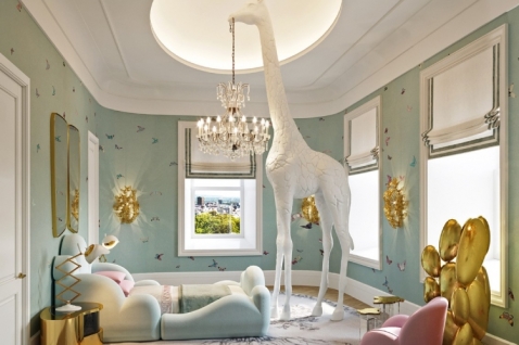
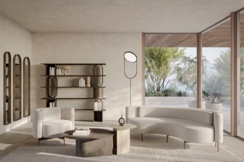
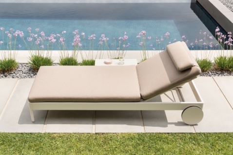
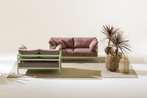
Photo: Salone del Mobile.Milano

Thanks to listening, neuroscience, and continuous research focused on innovation and experimentation, the experience at EuroCucina, FTK, Technology For the Kitchen, and the International Bathroom Exhibition has become more engaging and efficient, enabling visitors to focus on information they deem truly relevant, enhancing their ability to orient themselves and remember which booths they visited.
The 62nd edition of the Salone del Mobile.Milano represents a significant step in the development and evolution of the format and visitor experience at the fairs, thanks to the new collaboration with Lombardini22, a leading group in the Italian architectural and engineering scene, which has redesigned the exhibition layouts of the biennials dedicated to bathrooms and kitchens to create a more contemporary, efficient, and rewarding business platform.
Thanks to the inclusive spirit of the Salone del Mobile.Milano and the holistic approach to the project by Lombardini22, experts specializing in strategic design, neuroscience, and universal design have contributed to the evolution and innovation of pathways through the pavilions. This has allowed for the assessment of visitors' unconscious needs, reduction of cognitive load during visits, analysis of flows, and virtual verification of masterplans for pavilion layouts.
Cristian Catania, Project Director for Reinventing Fairs at Lombardini22, stated: "To showcase innovation, we need to become innovation. We are supporting the Salone del Mobile.Milano through a paradigm shift, from exhibition to experience. By combining our skills, we have built an integrated and comprehensive process of gradual evolution. It all starts with the general layout and the recognition of the importance of space as an enabling and attractive factor. Thanks to the masterplan, values of recognizability, comfort, involvement, and time have been implemented. Our project is designed to express the complexity and stratification at the fair, which no longer coincide solely with the product or commercial dimension, but also, especially, with the quality of the experience offered to visitors and ensuring visibility for exhibitors. The spaces function to make the event function."
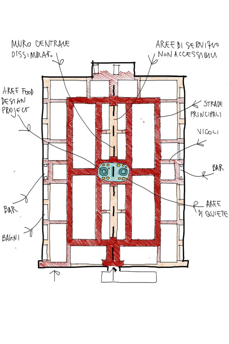 EuroCucina_Layout @Lombardini22
Maria Porro, President of the Salone del Mobile.Milano, commented: "The redesign of the 62nd edition of the Salone del Mobile stems from listening to visitors, exhibiting companies, and stakeholders from the bathroom and kitchen world, through field interviews or thematic working groups, to gather their perceptions, desires, and needs. This led to the integration of technology and home automation and a desire to give greater visibility to smaller and newer companies. We also wanted to go a step further than we did with the Euroluce exhibition, focusing on innovation through neuroscience. Lombardini22 analyzed the emotional behaviors and unconscious reactions of people moving around the pavilions and booths to better design space layouts and create a truly rewarding visitor path."
With the aim of optimizing time and space and simplifying visits, the pathways through the EuroCucina exhibition, with FTK, Technology For the Kitchen integrated into its spaces, and the International Bathroom Exhibition have been redesigned, while ensuring equal accessibility and visibility for all exhibitors. This project once again departs from the classic cardinal and decumanus layout, offering a reimagined urban loop form, making visits more rewarding yet less tiring, more efficient yet less scattered.
This year, the Salone del Mobile.Milano was the first among all international trade fairs to utilize neuroscience to assess visitor satisfaction levels and improve the visitor experience, optimizing exhibition pathways and evaluating visitors' reactions to different types of displays. The new loop-shaped layout is more intuitive and easier to navigate. Thanks to the modular nature of the grid, the traditional design of pavilions offers pure functionality, facilitating trade within spaces and technical perfection, but still contains some weaknesses, such as a high number of streets, lack of reference points, and the presence of asymmetrical paths along the pavilion perimeter where booths are arranged only on one side of the pathway.
However, thanks to the new layout, the exhibition offering remains meaningful along the entire left and right perimeter of the visitor walkway. In particular, a symmetrical path has been created by positioning booths along the outer perimeter walls, keeping technical walls out of visitors' sight. Main pathways have been widened, and provisions have been made for cultural installations and quiet areas to counter typical trade fair fatigue. Visiting all booths now requires only a 640-meter walk, instead of the previous 1.2 kilometers. A clear distinction has been made between main pathways, which are at least 6 meters wide, and secondary ones, making exhibitions easier to navigate, while cultural installations and quiet areas have been incorporated into the wider pathways.
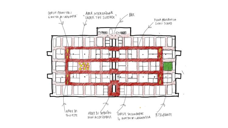 Salone Internazionale del Bagno_Layout @Lombardini22
Lombardini22 has also designed a display for one of the cultural offerings at EuroCucina: the central space dedicated to food design. This area is conceived as a distinctive and modular stage, both powerful and neutral, hosting a trade magazine, performer, artist, or brigade of food designers from around the world daily, presenting an unprecedented and original vision of the present and future of food.
The space is characterized by its unusual star shape, with curves and inlets easily adaptable to content and the work areas of food designers. Perimeter curtains, neutral in texture, fabric, and color, can be modulated to open or close the space as needed and create ad hoc settings. Even the lighting focused on the outline of the star – cold or warm, on or off, white or colored – can be regulated to allow for further customization and configurability. The space as a whole provides two adjacent and interconnected areas: a functional area with a laboratory and impressive workbench, and a display space for independent international books and magazines dedicated to the world of food design. The technical firewall between the two spaces has been turned from an obstacle into a design opportunity and will host video screenings. The entire display is circular and fluid, with continuity of finishes highlighting space hybridization.

